


SUB ROSA
TOURNAMET
Game Overview
“Sub Rosa Tournament" is a fast-paced, team-based 3D capture-the-flag game set in vibrant arenas.
Players choose from a diverse cast of characters, each with unique skills and roles, working together to outsmart and outplay the opposing team.
With strategic teamwork, clever character combinations, and intense action, the game offers endless replay ability and dynamic battles.
The objective is to capture the rival team's ball and bring it back to your base while defending your own, creating thrilling moments of offense and defense.
My Roll
As the UX/UI designer for Sub Rosa Tournament, I joined the project during its development phase, with core mechanics, characters, and structure already in place.
I began by collaborating with the game designer to establish the game architecture and user flow, and defined 4 user personas to understand player needs, ensuring a clear framework for the design process.
From there, I created a prioritized list of screens and elements.
After establishing a foundational style guide with fonts, colors, and a design aesthetic that captures the game’s spirit, I started designing UX and UI screens, progressing from high-level main screens to detailed in-game screens. Throughout, I developed an organized style guide with all elements, components, and micro-interactions to maintain consistency and flexibility across the design.
The Platform
-
Xbox
-
PlayStation
-
Nintendo Switch
Challenges
-
Designing an intuitive 2D interface for the main menu, ensuring it's clear and easy for players to navigate.
-
Displaying a wide selection of characters, professions, and skill combinations without overwhelming the player.
-
Building a scalable settings screen, organized into distinct sections, that isn't limited to the size of the screen.
-
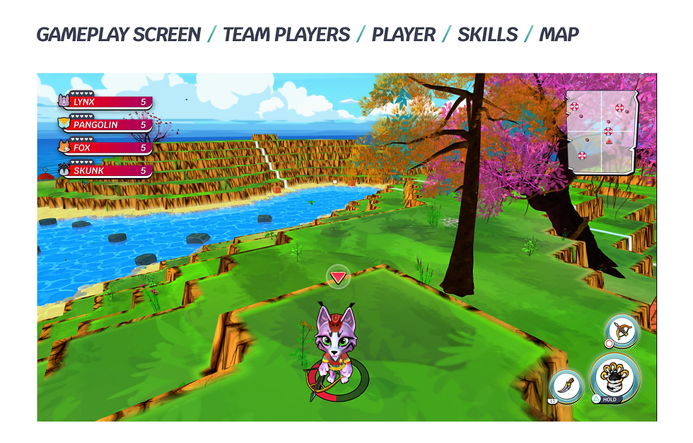
Adjusting the in-game HUD elements to enhance the player's experience without distracting them from the match.
-
Refining diegetic elements around the player to visually distinguish between the two teams.
User Persona


How The UI/UX Contribute To The Game
-
The appearance of the game has improved dramatically, hooking players right from the start.
-
The players have more tools on which to base their character's selection before the match.
-
Users can easily locate and adjust the settings they need.
-
The UI seamlessly integrates with the arena and aligns with the game's overall cartoonish aesthetic.
What Else
-
Adding billboards around the arena, featuring dynamic graphics and ads to amplify the game's sporty vibe.
-
Adding short 2D cinematic scenes.
-
Creating an arena selection screen.
-
Customizing certain UI elements to match the aesthetic and feel of the selected arena.
Game Architecture & User Flows


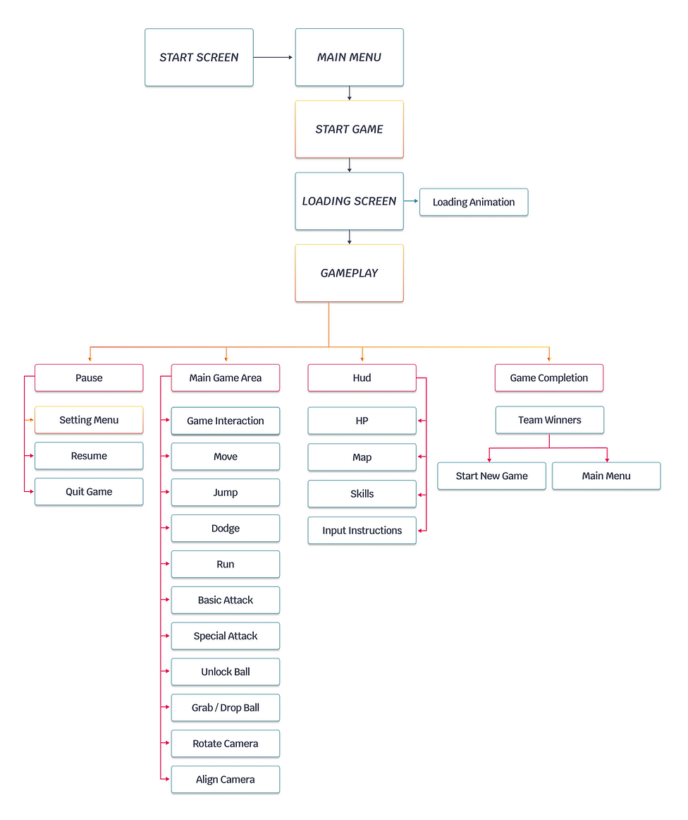
User Task Flow

Wireframing


Final Design and Guidlines


Software
-
Figma
-
Photoshop
Color Palette
In this game, I selected a color palette that balances classic comic-style contrasts with vibrant, energetic team colors. The primary black and white shades form a strong foundation reminiscent of comic art, giving the game a bold and graphic quality. This style not only adds a nostalgic feel but also enhances readability and character definition, making the visuals pop.
The secondary colors and team gradients introduce liveliness and variety. The orange and turquoise gradients, along with other team colors, add excitement and uniqueness, visually separating the teams and enhancing gameplay clarity.
This vibrant range, paired with solid colors for accents and indicators, ensures a visually engaging experience while maintaining clarity in dynamic, fast-paced action scenes.

Fonts and Typhography
For the game's comic-inspired, energetic design, I was looking for a font that was both dynamic and versatile, capturing the "kicking and jumpy" vibe the creator envisioned.
After testing several options, I chose Google's "Krub" font. Its unique blend of modern Thai letterforms and metal type era influences gave it an engaging, contemporary feel that suited the game's style.
"Krub" also offered a variety of weights, as well as uppercase and lowercase options, allowing for flexibility across different design elements and ensuring the typography could adapt seamlessly to the game's high-energy aesthetic.

Style
I chose a style with hard edges, bold strokes, and black and white outlines to evoke a comic and pop-art-inspired aesthetic, which aligns with the playful, dynamic energy of Sub Rosa Tournament.
These elements add a sense of depth and make the visuals "pop" in a way that captures the lively spirit of the game. The turquoise highlights on selected buttons further enhance this style, adding vibrant contrast and drawing attention to interactive elements, while still fitting into the comic-inspired theme.

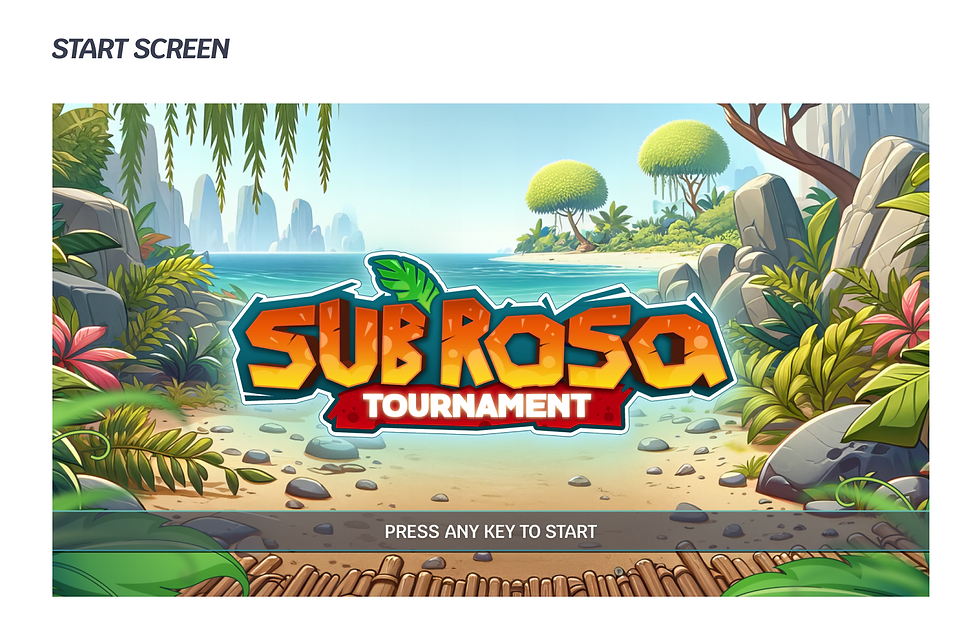
Game Logo
When I began designing the UI for Sub Rosa Tournament, the logo had already been created in a different style, with many details and graphic elements.
The creator and I "cleaned" it up by refining the elements and removing unnecessary details. This allowed us to align the logo more closely with the game's overall design style, creating a bold, clean look that’s both engaging and true to the game’s vibrant, comic-inspired aesthetic.

Components
All components were built and designed according to the established style, ensuring continuity and cohesion across fonts, colors, styles, and elements to support the game’s overall look and feel.
This consistency plays a crucial role in enhancing player engagement and improving the user experience, as a cohesive design helps players intuitively navigate the game.
Additionally, having a unified design system helped me to work more efficiently during the design process, making it easier to implement changes and manage all micro-interactions effectively.


Icons
The character skills, professions, and the beach ball icons were created by a game artist in 3D during my work on the UI.
I integrated them with the rest of the icons, elements, and components I designed to form a unified design system. The icon style enhances the comic-inspired, vibrant aesthetic of the game, adding a playful tone while supporting user experience with visual consistency across the interface.
